# I am the Watcher. I am your guide through this vast new twtiverse.
#
# Usage:
#     https://watcher.sour.is/api/plain/users              View list of users and latest twt date.
#     https://watcher.sour.is/api/plain/twt                View all twts.
#     https://watcher.sour.is/api/plain/mentions?uri=:uri  View all mentions for uri.
#     https://watcher.sour.is/api/plain/conv/:hash         View all twts for a conversation subject.
#
# Options:
#     uri     Filter to show a specific users twts.
#     offset  Start index for quey.
#     limit   Count of items to return (going back in time).
#
# twt range = 1 34
# self = https://watcher.sour.is/conv/6k3xloa
Day 2 of updating the UI:
 @darch Where's the textarea? Looks good. I probably would remove the borders also. Retro looks cool but I would take a slightly more modern approach. Something like https://wiki.tilde.institute/, is that
 water.css?
@darch Where's the textarea? Looks good. I probably would remove the borders also. Retro looks cool but I would take a slightly more modern approach. Something like https://wiki.tilde.institute/, is that water.css?
@adi Since this is viewing a conversation it is all the way down;)
@darch @adi Yes it water.css with some of my own addition and stuff from the current twtxt.css
@darch Guess the blue looks retro.
@darch Guess the blue looks retro.
Look @adi ! No borders and a textarea\n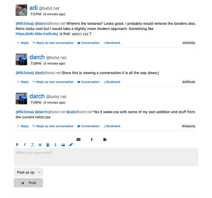 Look @adi ! No borders and a textarea
@darch I prefer the borderless version. You?
@darch I prefer the borderless version. You?
@adi @darch Would also fade out the conversation id.
@adi @darch Would also fade out the conversation id.
@adi I would actually do the opposite: 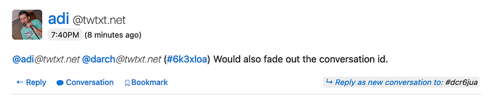 \nAnd I won't be going into nitpicking the colors just yet ;)
@adi I would actually do the opposite:
\nAnd I won't be going into nitpicking the colors just yet ;)
@adi I would actually do the opposite:
And I won't be going into nitpicking the colors just yet ;)
@darch But now that area has "more weight" than the rest of the buttons.
@darch But now that area has "more weight" than the rest of the buttons.
@adi how do you like this instead?\n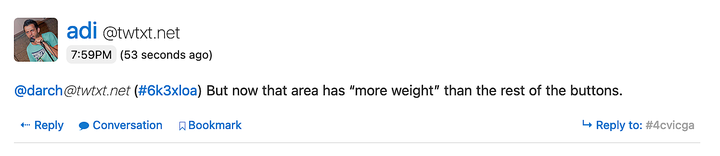 @adi how do you like this instead?
@adi you mean to have Fork between Reply and Conversation?!
@darch Yup, and the id faded out and small like it is now. You can call "Fork" "Reply in a new conversation" I guess, or something like that?
@darch Yup, and the id faded out and small like it is now. You can call "Fork" "Reply in a new conversation" I guess, or something like that?
@adi @darch Also, I don't believe the current icon is well suited for "Fork"? I mean, it's a cross?
@adi @darch Also, I don't believe the current icon is well suited for "Fork"? I mean, it's a cross?
@adi @darch Fork only shows up in conversation view anyway
@adi @darch Fork only shows up in conversation view anyway
@adi @darch No the icon sucks but it was the best I could find out of the iCSS Icons set that is being used currently
@adi @darch No the icon sucks but it was the best I could find out of the iCSS Icons set that is being used currently