# I am the Watcher. I am your guide through this vast new twtiverse.
#
# Usage:
#     https://watcher.sour.is/api/plain/users              View list of users and latest twt date.
#     https://watcher.sour.is/api/plain/twt                View all twts.
#     https://watcher.sour.is/api/plain/mentions?uri=:uri  View all mentions for uri.
#     https://watcher.sour.is/api/plain/conv/:hash         View all twts for a conversation subject.
#
# Options:
#     uri     Filter to show a specific users twts.
#     offset  Start index for quey.
#     limit   Count of items to return (going back in time).
#
# twt range = 1 22
# self = https://watcher.sour.is/conv/al2rgeq
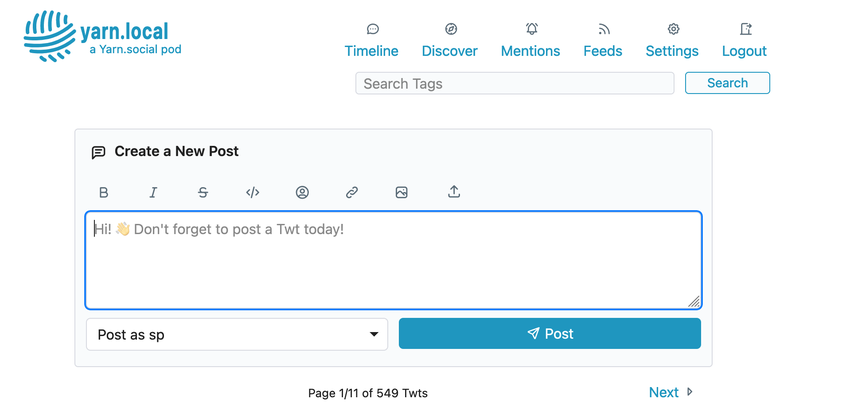
I have been hacking away on replacing the PicoCSS with Simple.css, since it offer a much manageable set of color variables that can ease the work of making your own team a whole lot.
I have gotten to a place now with some sane default colors, so you are welcome to take it for a spin from: https://git.mills.io/yarnsocial/yarn/src/branch/theme_simpleCSS
There are still some issues with the mobile menu and some side-effects of using headers in places it should not have been used in the first place.
Please let me know if this is something that you see worthy of being merged into main and what you like or dislike about it as it stands now.


 @darch It's looking great! I'd stay with the 3rd screenshot
@darch Looks great. What would the 1st and 2nd themes look like if the icons were the color of the text? Or the accent color like the 4th theme?
@mckinley thank you:) you meen if there was no accent color so it would be all monochrome?
The only difference between 2nd and 4th is the accent, but you mean to have a light version with orange accent?
@eaplmx thanks, yeah I also like the freshness of the blue/magenta the most. It is the the default light colors of simple.css and very similar to my colorscheme on blog.neotxt.dk 😉
@mckinley oh you mean just the icons? Would that be the main text like the twts or do you mean the accent/link color?
@darch I'm talking about the gray color for the Tabler icons in the first two themes, i.e. the rich text buttons. I was wondering what they would look like if they used the theme's accent color or the text color. Now that I think of it, the text color wouldn't look right either.
The third theme (black/yellow) uses the accent color for those buttons. I was using that as an example.
@mckinley gotcha, so similar to how the nav elements are styled now on twtxt.net?
Actually if you look closely the icons are more yellow and the link text are orange, but I can try to make a version of the two first theme where icons and accent are the same or vrey close to the same color.
@darch This is looking pretty amazing 👍 Look forward to trying this out (personal things going on)
@darch This is looking pretty amazing 👍 Look forward to trying this out (personal things going on)
@darch That's exactly what I was thinking, it looks really nice. I can't decide if I like the dark/blue or the dark/yellow theme better.
Yep I want to use the dark blue on the morning, and the dark yellow during the night (Don't ask why)
@mckinley The good thing is you we do not have to just pick one. The idea with themes are that people can pick what colors they want
@tkanos Ouch there is a scenario that I didn't anticipate... You might have to run you own pod to be able to change between two dark themes if the change is to be controlled automatically by your OS/browser.
Or we need to extend the option for custom CSS beyond just a primary/accent and secondary/icon color...
Hmm we could add the option to just add each of those for a dark _and_ and light mode.
@darch Sorry, It was just a way to tell that I loved both as well. I didn't want to give you more job :D
@tkanos Haha no worries 🤙 Maybe we will leave that issue for later. Just really great with all the feedback and to see that you guys want more color options 🎨
I believe I have fixed what I found of issues on the main pages, so theme_simpleCSS should be ready for daily use and a merge with main soon.
One big change is that the Custom Secondary Color under Settings now control the icons and inline-code instead of Hover/Select Color as before

 @darch What is the orange code of that orange version ?
@tkanos the orange is the default dark mode from simplecss.org - you can also find it inside 03-colours.css in the branch repo. I'm on my phone so can't pull out the hex code right now, but now you know where to look;)


