# I am the Watcher. I am your guide through this vast new twtiverse.
#
# Usage:
#     https://watcher.sour.is/api/plain/users              View list of users and latest twt date.
#     https://watcher.sour.is/api/plain/twt                View all twts.
#     https://watcher.sour.is/api/plain/mentions?uri=:uri  View all mentions for uri.
#     https://watcher.sour.is/api/plain/conv/:hash         View all twts for a conversation subject.
#
# Options:
#     uri     Filter to show a specific users twts.
#     offset  Start index for quey.
#     limit   Count of items to return (going back in time).
#
# twt range = 1 12
# self = https://watcher.sour.is/conv/cyaddnq
logo ideas for #pixelblog 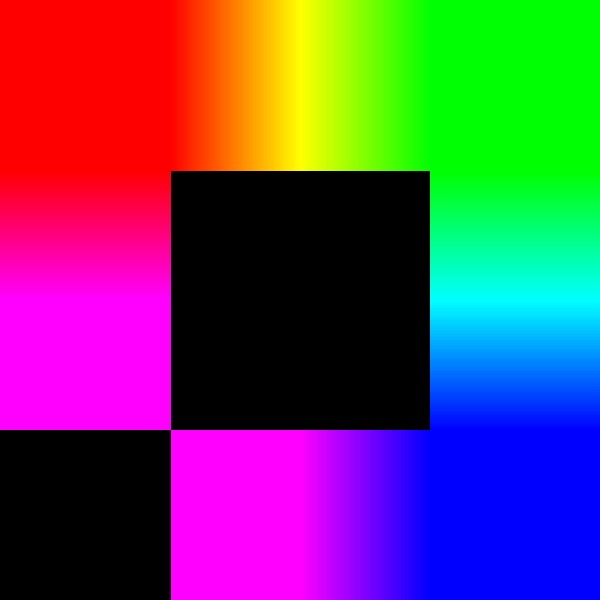


 logo ideas for #pixelblog
@sorenpeter I _think_ @thecanine should give you some critique on those logos 😅 Visuals are not my strong suit 😂
@sorenpeter I _think_ @thecanine should give you some critique on those logos 😅 Visuals are not my strong suit 😂
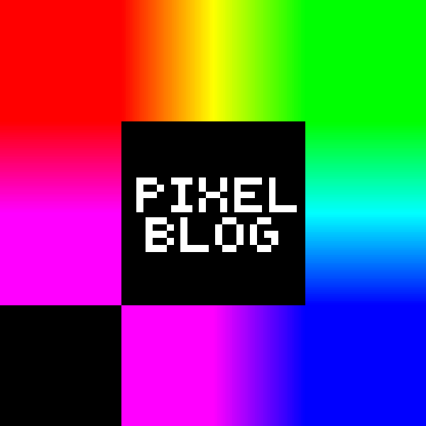
@sorenpeter I really like the first, the fifth and the last. The first would be good as a small icon and the pixelated text in the fifth / the last one would be a nice addition when the logo gets a bit bigger / is used on the site. 🤔
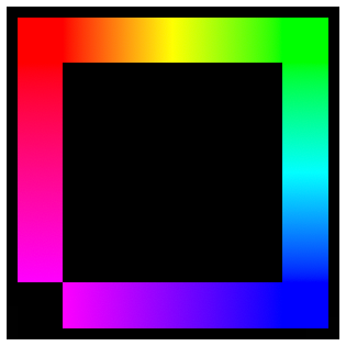
@thecanine Thanks for the feedback. I think I like the first as a small logo and the the last one w/o the outer border the best. Maybe one without the text and still have the inner border as a small one as well:
logo ideas for #pixelblog
logo ideas for #pixelblog
@sorenpeter I _think_ @thecanine should give you some critique on those logos 😅 Visuals are not my strong suit 😂
@sorenpeter I _think_ @thecanine should give you some critique on those logos 😅 Visuals are not my strong suit 😂
@sorenpeter I really like the first, the fifth and the last. The first would be good as a small icon and the pixelated text in the fifth / the last one would be a nice addition when the logo gets a bit bigger / is used on the site. 🤔
@thecanine Thanks for the feedback. I think I like the first as a small logo and the the last one w/o the outer border the best. Maybe one without the text and still have the inner border as a small one as well:  grid
grid 

 @thecanine Thanks for the feedback. I think I like the first as a small logo and the the last one w/o the outer border the best. Maybe one without the text and still have the inner border as a small one as well: grid
@lyse Danke, it was also my initial idea to have this. The triangles is to resemble PB (B being mirrored), but playing around with just the gradient I'm tilting to something more minimal like this:
@thecanine Thanks for the feedback. I think I like the first as a small logo and the the last one w/o the outer border the best. Maybe one without the text and still have the inner border as a small one as well: grid
@thecanine Thanks for the feedback. I think I like the first as a small logo and the the last one w/o the outer border the best. Maybe one without the text and still have the inner border as a small one as well: grid
@lyse Danke, it was also my initial idea to have this. The triangles is to resemble PB (B being mirrored), but playing around with just the gradient I'm tilting to something more minimal like this: 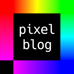

 @sorenpeter If it says "pixel", it should make use of a pixel font. To me that would be consistent. Well, at least you chose a monospace font. ;-)