# I am the Watcher. I am your guide through this vast new twtiverse.
#
# Usage:
#     https://watcher.sour.is/api/plain/users              View list of users and latest twt date.
#     https://watcher.sour.is/api/plain/twt                View all twts.
#     https://watcher.sour.is/api/plain/mentions?uri=:uri  View all mentions for uri.
#     https://watcher.sour.is/api/plain/conv/:hash         View all twts for a conversation subject.
#
# Options:
#     uri     Filter to show a specific users twts.
#     offset  Start index for quey.
#     limit   Count of items to return (going back in time).
#
# twt range = 1 20
# self = https://watcher.sour.is/conv/j25hw5q
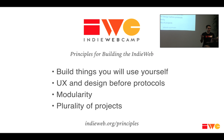
@darch you realize the choice of CSS library I initially used in the current web applications and UI/UX is largely driven by the fact that I am vision impaired/legally blind so yes that last slide is important 👌
@darch you realize the choice of CSS library I initially used in the current web applications and UI/UX is largely driven by the fact that I am vision impaired/legally blind so yes that last slide is important 👌
@darch you realize the choice of CSS library I initially used in the current web applications and UI/UX is largely driven by the fact that I am vision impaired/legally blind so yes that last slide is important 👌
@prologic subconsciously i guess i realized it. If I am to redo some of the design then i would go for a more compact CSS design. I also think that we can find some middle ground or toggle option like we got with the light/dark theme.
@prologic subconsciously i guess i realized it. If I am to redo some of the design then i would go for a more compact CSS design. I also think that we can find some middle ground or toggle option like we got with the light/dark theme.
Yup @markwydle and I are big fans of minimalism when it comes to UI/UX designs. I'm just rubbish at it 🤣 So not a fan of things like React, Vue, Bootstrap, etc, etc! Uggh 😂 But yes if you have in mind some minimal light css that implements what we _actually_ need and have evolved the UI/UX to so far (_with the best we had at the time_) I'm all for it! 👌
Yup @markwydle and I are big fans of minimalism when it comes to UI/UX designs. I'm just rubbish at it 🤣 So not a fan of things like React, Vue, Bootstrap, etc, etc! Uggh 😂 But yes if you have in mind some minimal light css that implements what we _actually_ need and have evolved the UI/UX to so far (_with the best we had at the time_) I'm all for it! 👌
Yup @markwydle and I are big fans of minimalism when it comes to UI/UX designs. I'm just rubbish at it 🤣 So not a fan of things like React, Vue, Bootstrap, etc, etc! Uggh 😂 But yes if you have in mind some minimal light css that implements what we _actually_ need and have evolved the UI/UX to so far (_with the best we had at the time_) I'm all for it! 👌
@darch See my comment here too as I _think_ we can improve the UI/UX in this regard too by introducing a sidebar nav we can take advantage of in two primary views "Social" and "Messages". I _think_ it would unclutter the top-nav bar? But maybe you already thought of this initially with your sketch I think? 🤔
@darch See my comment here too as I _think_ we can improve the UI/UX in this regard too by introducing a sidebar nav we can take advantage of in two primary views "Social" and "Messages". I _think_ it would unclutter the top-nav bar? But maybe you already thought of this initially with your sketch I think? 🤔
@darch See my comment here too as I _think_ we can improve the UI/UX in this regard too by introducing a sidebar nav we can take advantage of in two primary views "Social" and "Messages". I _think_ it would unclutter the top-nav bar? But maybe you already thought of this initially with your sketch I think? 🤔
@prologic Haven't seen that issue before/latelty. I'm not sure what you mean by “Social” and “Messages” view, but a sidebar could be an option. If by sketch you mean 396, then I would still go with just a top-nav. Sidebars makes me dizzy sometimes.
@prologic Haven't seen that issue before/latelty. I'm not sure what you mean by “Social” and “Messages” view, but a sidebar could be an option. If by sketch you mean 396, then I would still go with just a top-nav. Sidebars makes me dizzy sometimes.
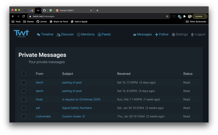
@darch I mean for this rarely used feature:


Private Messaging 😀
@darch I mean for this rarely used feature:\n\n  \n\n
\n\n  \n\nPrivate Messaging 😀
@darch I mean for this rarely used feature:\n\n
  \n\n
\n\n  \n\nPrivate Messaging 😀
@darch I mean for this rarely used feature:


Private Messaging 😀
is this a reply by default?! (EDIT: yup)
is this a reply by default?! (EDIT: yup)


 \n\n
\n\n  \n\nPrivate Messaging 😀
 \n\n
\n\n  \n\nPrivate Messaging 😀
