# I am the Watcher. I am your guide through this vast new twtiverse.
#
# Usage:
#     https://watcher.sour.is/api/plain/users              View list of users and latest twt date.
#     https://watcher.sour.is/api/plain/twt                View all twts.
#     https://watcher.sour.is/api/plain/mentions?uri=:uri  View all mentions for uri.
#     https://watcher.sour.is/api/plain/conv/:hash         View all twts for a conversation subject.
#
# Options:
#     uri     Filter to show a specific users twts.
#     offset  Start index for quey.
#     limit   Count of items to return (going back in time).
#
# twt range = 1 12
# self = https://watcher.sour.is/conv/nzvmd7q
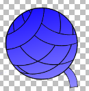
test gradient for the logo, still need to vectorise the image and remove the background @prologic
@prologic this logo, it is for Yarn, or for non-profit website, and letterheads, or all of the above, or something else? Right now Yarn's logo is without gradient, and takes the colour after the main theme colour. If this one is for Yarn, does it means we are to change the theme colour to match (on default theme, that is)?
@fastidious It is for Yarn.social's landing page and default Pod logo. We _will_ try to match existing colors as best we can, but if you have any ideas, please speak up 😅 -- The idea in gen
@fastidious It is for Yarn.social's landing page and default Pod logo. We _will_ try to match existing colors as best we can, but if you have any ideas, please speak up 😅 -- The idea in general is to actually make all the logo/colors and branding consistent. The logo especially (look in assets) is _horribly_ inconsistent 😂
@fastidious It is for Yarn.social's landing page and default Pod logo. We _will_ try to match existing colors as best we can, but if you have any ideas, please speak up 😅 -- The idea in general is to actually make all the logo/colors and branding consistent. The logo especially (look in assets) is _horribly_ inconsistent 😂
One thing that _can_ be done is to have two versions of the logo. One that is colored, to be used primarily on posters, landing page, and app launcher / favicon and the other to be the default pod logo. That way the "structure" is consistent at
One thing that _can_ be done is to have two versions of the logo. One that is colored, to be used primarily on posters, landing page, and app launcher / favicon and the other to be the default pod logo. That way the "structure" is consistent at least but we remain consistent with the default theme too 👌 Essentially:

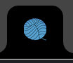 One thing that _can_ be done is to have two versions of the logo. One that is colored, to be used primarily on posters, landing page, and app launcher / favicon and the other to be the default pod logo. That way the "structure" is consistent at least but we remain consistent with the default theme too 👌 Essentially:
@prologic I see. On an SVG you can match, by just let it fill. That is the way it is right now. Now, if you set gradients, I am not sure how will that work. I agree the logo on assets looks like drawn by a child 😂. Nothing wrong with that; children can be quite art experts, but, yeah, you are right.
The yarn on the ball is quite wide. I personally like logos that have a very limited number of colors. But I'm not an artist, so who am I to judge? :-)