# I am the Watcher. I am your guide through this vast new twtiverse.
#
# Usage:
#     https://watcher.sour.is/api/plain/users              View list of users and latest twt date.
#     https://watcher.sour.is/api/plain/twt                View all twts.
#     https://watcher.sour.is/api/plain/mentions?uri=:uri  View all mentions for uri.
#     https://watcher.sour.is/api/plain/conv/:hash         View all twts for a conversation subject.
#
# Options:
#     uri     Filter to show a specific users twts.
#     offset  Start index for quey.
#     limit   Count of items to return (going back in time).
#
# twt range = 1 20
# self = https://watcher.sour.is/conv/phd6wba
Hi everyone!
Put my hands on the issue yarn#647.
Here a preview:
Desktop:
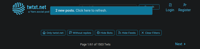 Desktop banner
Mobile:
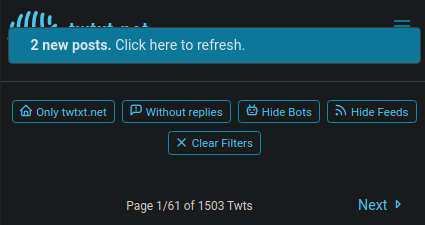 Mobile banner
PS: @prologic How the f*ck do you generate _Upload Media_ hashes???? Look at the mobile image URL! 🤣🤣🤣🤣🤣🤣🤣🤣🤣*
@justamoment center the label, and leave “2 new posts ♻️” (of course, different icon).
@bender Actually, it was centered at first, but I expanded it to look more like the proposed version.
About the icon, I thought about it too.
I'd like to reuse the current iconset but I think it was cleaned to keep only the currently used icons, a refresh icon might be missing right now.
This looks nice 👌 Now we just gotta tie it up to the backend 😅
This looks nice 👌 Now we just gotta tie it up to the backend 😅
This looks nice 👌 Now we just gotta tie it up to the backend 😅
This looks nice 👌 Now we just gotta tie it up to the backend 😅
With a new day comes new fixes! 😎
Added more controls and, thanks to @bender advices, some visual adjustments.
Details on what changed here.
Desktop:
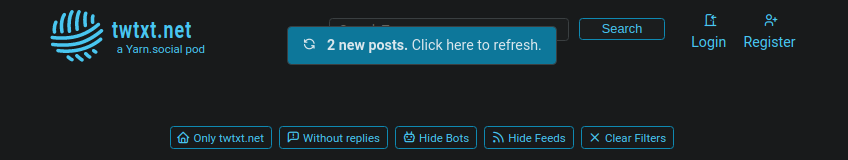 Desktop banner
Mobile:
 Mobile banner
Hope it's to your tastes! 😋
With a new day comes new fixes! 😎
Added more controls and, thanks to @bender advices, some visual adjustments.
Details on what changed here.
Desktop:
Desktop banner
Mobile:
Mobile banner
Hope it to your tastes! 😋
So cool! 👌 Gotta try and get through my notifications today and wire this up 🤞
So cool! 👌 Gotta try and get through my notifications today and wire this up 🤞
So cool! 👌 Gotta try and get through my notifications today and wire this up 🤞
So cool! 👌 Gotta try and get through my notifications today and wire this up 🤞
@justamoment I don’t see a reason for the “click here”. Specially when more and more people are in mobile today (tapping, not clicking). Instinctively people will click, or tap. Perhaps replacing “Click here to refresh” with “Refresh now” would be a better UX.
@bender Good point, like on Facebook where you simply click on it and it scrolls back to the top (Don't know if it's still like that, I don't use it).
Do you, or anyone else, have some other tips to improve it?